
CASE STUDY – EMPLOYMENT INSURANCE (EI) APPLICATION MODERNIZATION
Redesigning how millions of Canadians apply for Employment Insurance.
A two-year, government-scale modernization of a legacy system people depend on during job loss, illness, and caregiving — and one of the largest digital transformation efforts in the federal government.
CLIENT
Employment and Social Development Canada (ESDC)
TYPE
Mobile-first, Web Responsive
DURATION
Ongoing (Year 2)
TOOLS
Figma, Miro, Mural, Azure DevOps
ROLE
Senior Product Designer — IC across multiple pods
TEAM
Cross-functional — designers, BAs, content, product, SMEs, developers
OVERVIEW
One of the largest digital transformations in the federal government, built on systems decades old.
Canada's Employment Insurance program processes millions of claims a year, but the application experience hadn't meaningfully changed in decades. Aging legacy systems, policy-driven architecture, and a government-wide push to modernize digital services created the conditions for a significant overhaul.
The existing experience was dense, jargon-heavy, and built around policy logic rather than human behaviour. High drop-off rates and error-driven rejections weren't just a content problem. They were a structural one affecting Canadians during some of the most vulnerable moments of their lives: job loss, illness, caregiving, etc.
I've been embedded in the program for over two years, across multiple pods: hands-on flow design, systems work, and a service design role on the planning team shaping future releases alongside program leadership.
THE PROBLEM
Users weren't failing because the policy was hard. They were failing because the experience gave them no tools to succeed.
The application dumped everything on users at once, with no signal of what mattered now versus later. No progress visibility, no way to prepare, no way to catch errors before submitting. People were making high-stakes choices like tax elections and income declarations, with no context or guidance.
So the real problem wasn't "simplify a complex system." It was: how do you build structure that gives people confidence, without touching policy or legal constraints?
THE WORK
Four connected changes, each aimed at a specific point of failure.
01
UX audit and heuristic evaluation
I mapped the end-to-end application to find recurring patterns of confusion rather than one-off screen issues. That moved the work from fixing UI to fixing structure, and led to reorganizing the application through a series of card-sorting workshops.
02
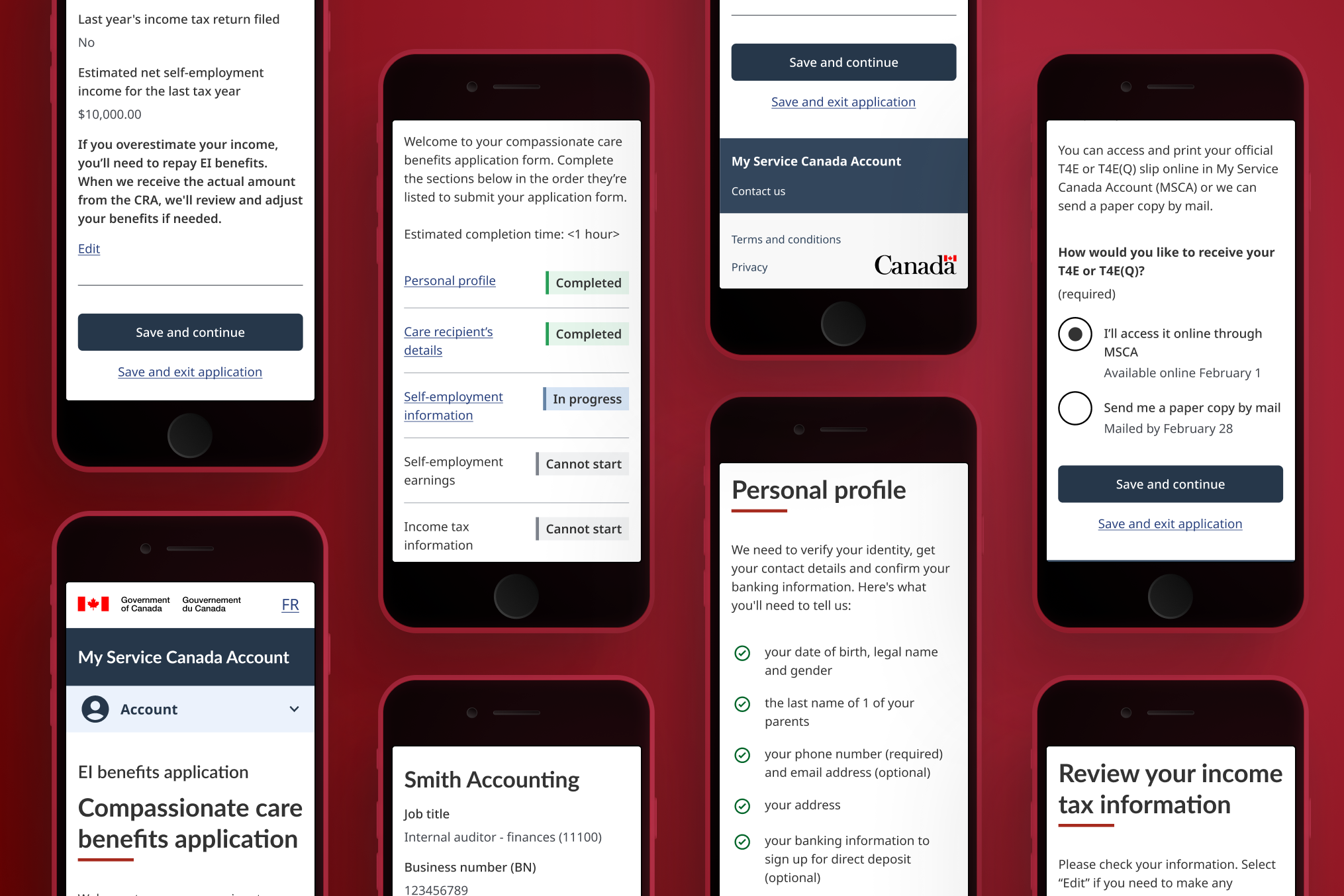
Application homepage and wayfinding
A central hub with a clear entry point, visible section statuses, and a realistic time estimate upfront. If users knew where they were and what was coming, early drop-off would decrease. User testing validated this and participants moved through flows with significantly less hesitation.
03
Section checklists
A lightweight pattern shown before each section, not instructions but information that allowed people to prepare. They arrived knowing what they'd need, which cut backtracking and mid-flow errors.
04
Review pages
A clear summary of inputs before submitting, editable without restarting. Designed to cut rejections caused by entry errors rather than intent.
In policy-driven systems, clarity doesn't come from simplification. It comes from structure and from design decisions that hold up under constraint.

SYSTEMS & SCALE
Designing the system that let multiple pods ship consistently.
As the work expanded across pods and benefit types, I co-initiated a shared component library. This became a single source of truth for interaction patterns, component states, and question variants. It became an active tool that let multiple design pods ship consistently without constant coordination overhead.
I also introduced Design QA checkpoints as the work shipped. This is involved auditing screens in build (and in context) to catch drift early and surface systemic gaps before they compounded.
OUTCOME
People moved through the new flows with less hesitation, and less help.
User testing showed participants moving through modernized flows with little to no guidance. They reused patterns naturally, hesitated less, and reported more confidence before submitting. The homepage, checklists, and review pages worked together, not in isolation.
As the program has scaled, so has my role within it. Moving from delivery into the planning team meant shifting focus. I started with designing features for Canadians navigating EI, to designing the processes and flows that help our designers, business analysts, content designers, and user researchers do their best work. Working directly alongside program leadership, I'm now focused on streamlining how design and delivery actually function on the ground, turning two years of iterations, learnings, and incoming data into a foundation the whole team can build from.
WHERE IT STANDS
Two years in, I've worked across the full range of the program.
I've held several roles across this program as the work demanded them: design lead, senior designer and IC, and service designer. That's meant hands-on flow design in delivery pods, systems work spanning multiple pods, and a stretch on the planning team shaping future releases with program leadership.
Right now I'm back in delivery, split 50/50 across two pods, bringing that lead, systems, and planning perspective into the day-to-day work.
LEARNING
In policy-driven systems, clarity doesn't come from simplification. It comes from structure, reusable patterns, and design decisions that hold up under constraint. But the deeper learning was about adaptability. It was learning to become water and to take the shape of whatever container I was given, whether that was a delivery pod, a systems problem, or a seat at the planning table with program leadership. This project taught me that the best designers aren't the ones with the most polished process, they're the ones who stay curious, stay malleable, and keep showing up in the mess.
NDA NOTICE
This work is under NDA. Detailed flows, design decisions, and validation findings are available to discuss in conversation.