

CASE STUDY – CMHC MULTI-UNIT MORTGAGE LOAN INSURANCE (MU MLI) PROGRAM
Designing a lending workflow that lenders could actually trust.
Digitizing how lenders submit, track, and attest to multi-unit mortgage insurance applications for one of Canada's largest housing institutions.
CLIENT
Canada Mortgage and Housing Corporation (CMHC)
TYPE
Enterprise Web Portal - Delivered; rolling out in phases
DURATION
6 Weeks (January to March)
TOOLS
Figma
ROLE
Primary Product Designer
TEAM
Design lead, BAs, devs, product, CMHC stakeholders
THE CONTEXT
A critical insurance process running on email and manual entry.
CMHC insures multi-unit mortgage loans for lenders across Canada. For years, the entire process ran on email, paper, and manual data entry.
A lender would submit an application by emailing documents to CMHC. Staff would manually re-enter that data into internal underwriting systems. Once submitted, the lender had no visibility into where their application stood. No status, no confirmation, no clear line of communication. It worked, but it was slow, error-prone, and opaque. For lenders managing high-value, time-sensitive deals, that lack of visibility created real business risk.
CMHC partnered with our team to modernize this workflow over multiple phases. Phase 3 (my phase) focused on digitizing the most critical lender-facing moments: the ones where accuracy, confidence, and trust mattered most.
THE CHALLENGE
Designing for trust inside a process with no room to iterate.
Phase 3 had a fixed six-week timeline, BA-driven requirements, and a clear expectation: pixel-perfect, accessible, and immediately buildable.
Requirements often arrived pre-solutioned. BAs and stakeholders would jump to interaction patterns before the underlying requirement was fully understood. There wasn't room for long discovery or multiple rounds of divergent exploration. At the same time, the workflows themselves were genuinely complex. Lenders needed to submit different types of requests, upload supporting documentation, and legally attest to the accuracy of their submissions. These weren’t casual interactions. Getting them wrong had regulatory and financial consequences.
How do you design something trustworthy and usable inside a process that doesn't give you much room to iterate?
WHAT I DESIGNED
Three features that moved the highest-stakes moments out of email.
Phase 3 focused on two areas of the portal: a standalone request system lenders could use at any time, and the critical final steps of the application submission flow, where documentation, review, and legal sign-off all had to feel trustworthy and clear.
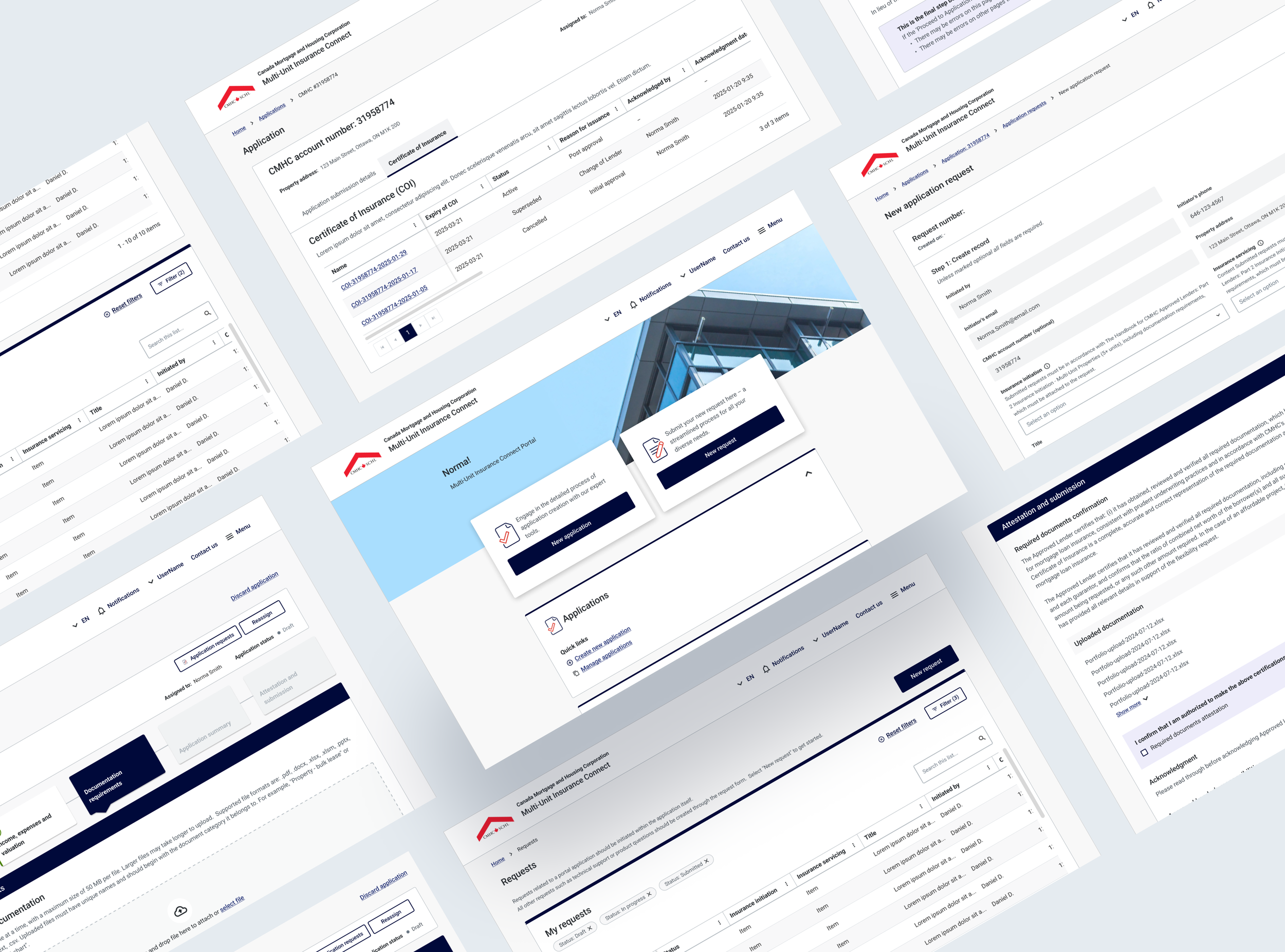
Lenders needed a way to ask CMHC for support at any point. This could include something about a specific application, or something more general. Rather than splitting these into separate flows, I designed a unified request model that handled both from one entry point. The goal was reducing the "where do I go for this?" friction so lenders could get help without second-guessing which path to take. But it wasn't just about the lender side. On the CMHC side, requests had historically lived in long email threads with no clear structure, making it difficult to track, prioritize, or even find what had been asked. A consolidated request system meant both sides got clarity: lenders could submit and track their requests in one place, and CMHC staff could see everything coming in without piecing it together from scattered conversations.
Requests (General and Application-Specific)
Unified request model — one entry point for both general and application-specific inquiries, available anytime outside the application flow.
The application submission flow
The core of Phase 3 was the final stretch of the application journey. It was the final set of connected steps where lenders upload documentation, review their full submission, and legally attest to the information before it goes to underwriting. Each step builds on the last, so the experience had to hold up across long, complex applications without losing the lender along the way.
Documentation Requirements
Missing or incorrect files delay underwriting and create back-and-forth. Some applications required 20 to 50+ supporting documents, which created significant room for things to get missed or attached incorrectly. The upload experience needed to make that volume manageable: clear requirements, confirmation that each file was received, and a consolidated view so lenders could scan everything in one place and catch errors before submission.

Documentation upload: clear file requirements and confirmation states, reducing back-and-forth with CMHC staff.
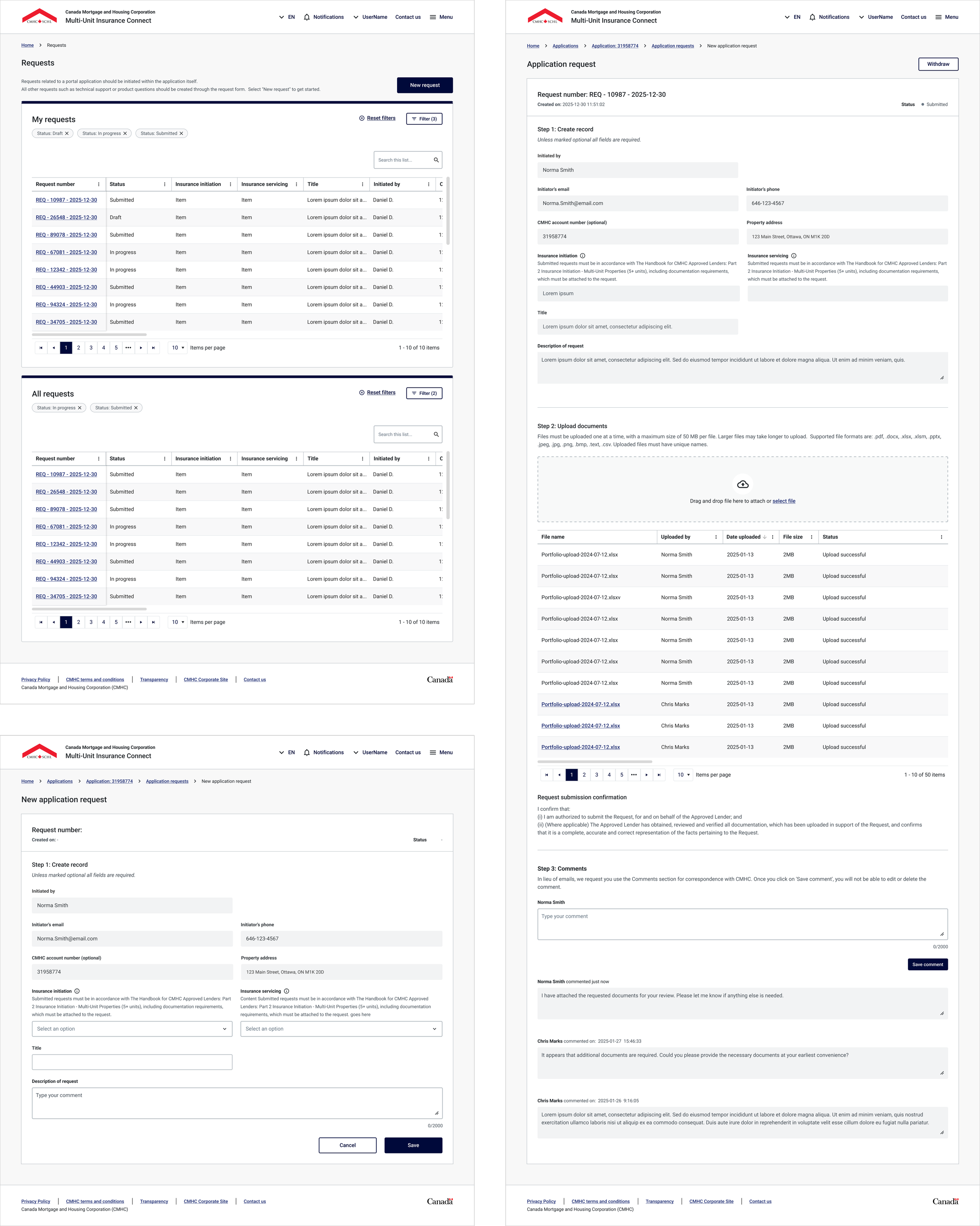
Application Summary
These applications are long, and lenders don't always complete them in one sitting. The summary step gives them a way to review everything they've entered, spot what's incomplete or incorrect, and navigate back into specific sections to make changes. It's the last checkpoint before the legal attestation, so it had to make a complex application feel reviewable, not overwhelming.
Application summary — a scannable review of all submitted information, organized by section with completeness indicators.
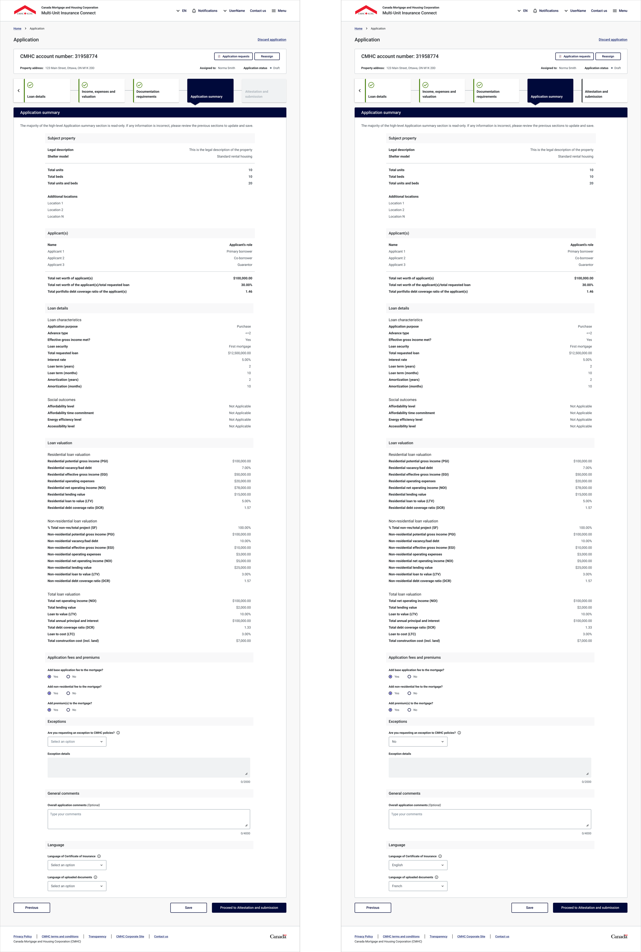
Attestation and Submission
This is the highest-stakes moment in the flow. Lenders formally attest that everything in their application is accurate and it carries legal weight. I designed this step with clear language, explicit confirmation actions, and no ambiguity about what the lender is agreeing to. This final step is a place where you want the user to be slow, intentional, and isn’t a place where you want users clicking through quickly.
Legal attestation: deliberate pacing, explicit confirmation language, and clear finality at submission.
MY ROLE
Primary designer on Phase 3, co-owning the work with my design lead.
Slowing down premature solutioning
The most valuable thing I did was repeatedly pulling conversations back to the actual requirement before committing to a design direction. In a BA-driven environment, there's constant pressure to just get something on screen. I pushed back, not to slow things down, but to make sure we weren't designing the wrong thing fast!
Real-time design iteration
Timelines meant I couldn't always go away and come back with polished options. During in-person sessions, I was making design changes live and walking the client through the rationale in the same breath. That required comfort with the problem space and confidence to make decisions on the spot.
Trading ideal for reliable
The biggest trade-off I made was choosing clarity, consistency, and predictability over custom interactions. I prioritized patterns that were unambiguous for lenders, straightforward for devs to build, and wouldn't introduce edge cases we couldn't pressure test in time.
For a business-critical workflow handling legal and financial submissions, reliability is the design quality.

Scenes from CMHC’s Ottawa office during our in-person collaboration week.
OUTCOMES & IMPACT
So, what changed?
Reduced manual data entry
Lender submissions now flow directly into CMHC's systems, replacing the email-and-reenter workflow.
Created lender visibility
For the first time, lenders can track application status instead of waiting in the dark.
Improved submission accuracy
Structured forms and inline validation reduced errors at the point of entry.
Delivered on time
Phase 3 completed within six weeks and handed off to dev without significant rework.
NDA Notice: This project is covered under NDA. Visuals and details shown here are limited to what has been approved for portfolio use. Happy to discuss in more depth in conversation.
REFLECTIONS
What this project reinforced
This project taught me something I keep coming back to: the hardest design problems aren't always about the interface. They're about the environment. How decisions get made, how fast you need to move, and whether anyone carved out space for design thinking in the first place.
The timeline and process weren't built with design in mind. Requirements came from BAs, decisions moved fast, and there was no dedicated room for exploration. But that didn't mean design didn't belong there. It really meant that I had to make room for it myself. That's a practice in being the voice of the user when no one else in the room is playing that role.
It also reinforced the skill, and honestly, the beauty of iterating on the spot. Presenting work live, watching reactions in real time, and adjusting in the moment taught me more about my own design instincts than any polished review cycle could. And working at this level of fidelity under pressure sharpened my visual design craft in a way that slower projects don't always demand.