

CASE STUDY — JOURNEY MAPPING & SERVICE DESIGN FOR TRUDELL MEDICAL
Making a new system make sense before anyone had to use it.
CLIENT
Trudell Medical
TYPE
Journey Mapping · Service Design
DURATION
13 Weeks
TOOLS
Figma, Microsoft Dynamics 365
ROLE
Product Designer (IC)
TEAM
Experience team of 2, PM, D365 technical teams
A medical manufacturer replacing its core systems, with no shared picture of what the future looked like.
THE CONTEXT
Trudell Medical, a respiratory health manufacturer, was migrating to Microsoft Dynamics 365 and replacing legacy systems across Sales, Customer Service, and Field Service with two connected platforms. The goals were to unlock operational insights, improve employee and customer experience, and drive performance.
But platform migrations don't fail because the technology is wrong. They fail because the people who need to use the system can't picture how their work changes.
Field technicians, salespeople, and customer service reps all had different workflows, different tools, and entirely different mental models. Our team was brought in to make the transformation visible and comprehensible before it happened
THE CHALLENGE
Everyone needed to see the same transformation, but no two roles experienced it the same way.
D365 would unify Trudell's operations onto a single platform, but the day-to-day experience of using it would be completely different depending on your role. A field service technician's workflow had almost nothing in common with a customer service rep's. A salesperson's relationship with the platform was different again.
Map everything at the same level of detail, and the result would be dense, technical, and useful to no one. Stay too high-level, and the maps would feel abstract. Essentially, they’d be fine for leadership presentations, but useless for the people who'd actually work inside the system every day. From that, the question became:
How do you design artifacts that serve leadership's need for strategic clarity and an individual employee's need to understand what their job looks like on Day 1?
11 journey maps across 3 modules, 2 platforms, 1 connected system.
THE CHALLENGE
Over 13 weeks, I designed all journey maps end-to-end, translating technical platform logic into visual narratives that made the transformation tangible for every audience. Research started with workshops across leadership and field staff, paired with hands-on exploration of D365 modules and direct collaboration with the technical teams building the platform.
Two things became clear very quickly. The maps needed to be narrative-driven, not technically exhaustive, and D365's own vocabulary was a barrier. The maps had to speak the language of the employees, not the platform.
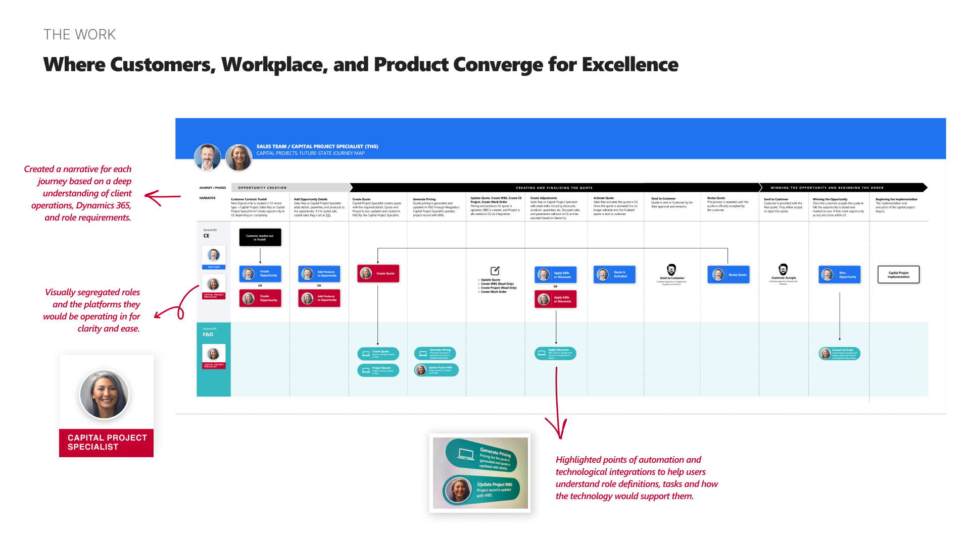
01 – Visual separation of roles and platforms
Rather than mapping everything in a single swimlane, I separated each role and the platforms they operated across. This made it immediately clear where responsibilities lived and where handoffs happened between teams. The early impulse from stakeholders was to unify everything visually, which would have hidden the very boundaries we were trying to clarify.

02 – Narrative framing over technical specification
Each journey was structured as a story: here's who you are, here's what you're trying to do, here's how the technology supports you. A deliberate choice to prioritize comprehension over completeness. The technical specs existed elsewhere; these maps needed to build understanding and confidence.
03 – Strategic enough for leadership, specific enough for Day 1!
Leadership needed to see how teams and systems connected across the organization. Individual contributors needed to know what their actual day-to-day would look like. Rather than creating two separate sets of maps, I designed each one to work at both levels. Clear enough to present in a leadership meeting, detailed enough to onboard someone into their new workflow.

04 – Showing how each role connected to the customer and to each other
The maps didn't just show individual workflows in isolation. They highlighted where different roles overlapped, where customers interacted with Trudell directly, and where feedback loops existed. This made the maps useful not just for understanding your own role, but for understanding how your work connected to everyone else's.
The maps became more than documentation. They became how Trudell talked about its own transformation.
THE IMPACT
What started as a journey mapping exercise became a foundational change management tool across three areas:
Licensing strategy. The visual separation of roles and platforms made it clear who needed access to what, and when. This gave leadership the information they needed to develop their D365 licensing model.
Employee training. The maps were adopted as the basis for new training materials, giving Trudell a way to onboard people into the D365 world with clarity instead of confusion.
"This work is foundational for establishing and communicating 'who lives where' in the new D365 world."
— Trudell leadership
A shared language between business and IT. Across the organization, the maps became the common reference point for conversations that had previously been mired in technical jargon.
REFLECTION
The most impactful work wasn't a screen.
This project didn't involve designing interfaces. The work was about turning a platform migration that only existed in technical documentation into something every person in the organization could actually read, follow, and use.
My takeaway was that sometimes the most impactful design work is structural. Finding the right level of detail, choosing what to show and what to leave out, and designing artifacts that serve multiple audiences without collapsing into oversimplification or noise. The journey maps worked because they held a point of view about what clarity meant for each role, not because they documented every edge case.